基础用法
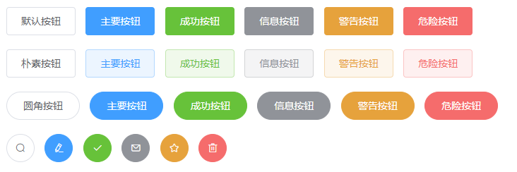
使用type、plain、round和circle属性来定义 Button 的样式。
<el-row>
  <el-button>默认按钮</el-button>
  <el-button type="primary">主要按钮</el-button>
  <el-button type="success">成功按钮</el-button>
  <el-button type="info">信息按钮</el-button>
  <el-button type="warning">警告按钮</el-button>
  <el-button type="danger">危险按钮</el-button>
</el-row>

<el-row>
  <el-button plain>朴素按钮</el-button>
  <el-button type="primary" plain>主要按钮</el-button>
  <el-button type="success" plain>成功按钮</el-button>
  <el-button type="info" plain>信息按钮</el-button>
  <el-button type="warning" plain>警告按钮</el-button>
  <el-button type="danger" plain>危险按钮</el-button>
</el-row>

<el-row>
  <el-button round>圆角按钮</el-button>
  <el-button type="primary" round>主要按钮</el-button>
  <el-button type="success" round>成功按钮</el-button>
  <el-button type="info" round>信息按钮</el-button>
  <el-button type="warning" round>警告按钮</el-button>
  <el-button type="danger" round>危险按钮</el-button>
</el-row>

<el-row>
  <el-button icon="el-icon-search" circle></el-button>
  <el-button type="primary" icon="el-icon-edit" circle></el-button>
  <el-button type="success" icon="el-icon-check" circle></el-button>
  <el-button type="info" icon="el-icon-message" circle></el-button>
  <el-button type="warning" icon="el-icon-star-off" circle></el-button>
  <el-button type="danger" icon="el-icon-delete" circle></el-button>
</el-row>
禁用状态

你可以使用disabled属性来定义按钮是否可用,它接受一个Boolean值。
<el-row>
  <el-button disabled>默认按钮</el-button>
  <el-button type="primary" disabled>主要按钮</el-button>
  <el-button type="success" disabled>成功按钮</el-button>
  <el-button type="info" disabled>信息按钮</el-button>
  <el-button type="warning" disabled>警告按钮</el-button>
  <el-button type="danger" disabled>危险按钮</el-button>
</el-row>

<el-row>
  <el-button plain disabled>朴素按钮</el-button>
  <el-button type="primary" plain disabled>主要按钮</el-button>
  <el-button type="success" plain disabled>成功按钮</el-button>
  <el-button type="info" plain disabled>信息按钮</el-button>
  <el-button type="warning" plain disabled>警告按钮</el-button>
  <el-button type="danger" plain disabled>危险按钮</el-button>
</el-row>
文字按钮

<el-button type="text">文字按钮</el-button>
<el-button type="text" disabled>文字按钮</el-button>
图标按钮

设置icon属性即可,icon 的列表可以参考 Element 的 icon 组件,也可以设置在文字右边的 icon ,只要使用i标签即可,可以使用自定义图标。
<el-button type="primary" icon="el-icon-edit"></el-button>
<el-button type="primary" icon="el-icon-share"></el-button>
<el-button type="primary" icon="el-icon-delete"></el-button>
<el-button type="primary" icon="el-icon-search">搜索</el-button>
<el-button type="primary">上传<i class="el-icon-upload el-icon--right"></i></el-button>
加载中

要设置为 loading 状态,只要设置loading属性为true即可。
<el-button type="primary" :loading="true">加载中</el-button>
不同尺寸

额外的尺寸:medium、small、mini,通过设置size属性来配置它们。
<el-row>
  <el-button>默认按钮</el-button>
  <el-button size="medium">中等按钮</el-button>
  <el-button size="small">小型按钮</el-button>
  <el-button size="mini">超小按钮</el-button>
</el-row>
<el-row>
  <el-button round>默认按钮</el-button>
  <el-button size="medium" round>中等按钮</el-button>
  <el-button size="small" round>小型按钮</el-button>
  <el-button size="mini" round>超小按钮</el-button>
</el-row>
Attributes
| 参数 | 说明 | 类型 | 可选值 | 默认值 |
|---|---|---|---|---|
| size | 尺寸 | string | medium / small / mini | — |
| type | 类型 | string | primary / success / warning / danger / info / text | — |
| plain | 是否朴素按钮 | boolean | — | false |
| round | 是否圆角按钮 | boolean | — | false |
| circle | 是否圆形按钮 | boolean | — | false |
| loading | 是否加载中状态 | boolean | — | false |
| disabled | 是否禁用状态 | boolean | — | false |
| icon | 图标类名 | string | — | — |
| autofocus | 是否默认聚焦 | boolean | — | false |
| native-type | 原生 type 属性 | string | button / submit / reset | button |