首页card
说明:
最外层 div 上的margin、padding控制div的外边距和内边距,四个值分别为上、右、下、左
<div style="padding: 0px 0px 0px 0px;margin: 0px 0px 0px 0px;">
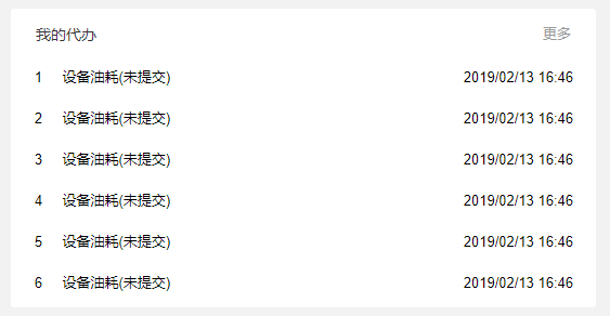
<base-card title="我的代办" more="更多" :more-handler="moreHandler">
<ul class="todoList-wrapper">
<li class="item" :class="index===activeIndex?'active':''" v-for="(d ,index) in listData" @click="activeIndex=index">
<el-row>
<el-col :span="2" class="col"><span class="index">{{index+1}}</span></el-col>
<el-col :span="12" class="col" style="text-align: left"><span class="title">{{d.title}}</span></el-col>
<el-col :span="10" class="col" style="text-align: right;padding-right: 15px;"><span class="time">{{d.time}}</span></el-col>
</el-row>
</li>
</ul>
</base-card>
</div>
import BaseCard from '@/components/BaseCard/BaseCard' // 卡片外边框
export default {
  data() {
    return {
      activeIndex: null
    }
  },
  components: {
    BaseCard
  },
  props: {
    listData: {
      type: Array,
      default: function() {
        return [
          { title: '设备油耗(未提交)', time: '2019/02/13 16:46' },
          { title: '设备油耗(未提交)', time: '2019/02/13 16:46' },
          { title: '设备油耗(未提交)', time: '2019/02/13 16:46' },
          { title: '设备油耗(未提交)', time: '2019/02/13 16:46' },
          { title: '设备油耗(未提交)', time: '2019/02/13 16:46' },
          { title: '设备油耗(未提交)', time: '2019/02/13 16:46' }]
      }
    }
  }
}
<style scoped lang="scss">
   .todoList-wrapper{
     width: 100%;
     .item{
       line-height: 38px;
       position: relative;
       cursor: pointer;
       span:{
         font-size:13px;
         color:#333333FF;
       }
       .time{
         padding-right: 3px ;
       }
       .col{
         text-align: center;

       }
     }
     .item.active{
       background: rgba(236,241,255,1);
     }
     .item:hover{
       transition: all .5s;
       background: rgba(236,241,255,1);
     }
   }
 </style>
← 表单 baseCard-按钮 →